Monday 20 February 2012

Popularity

Popularity is being surrounded by friends who admire you, in my opinion.
Of course it means all sorts of other things, some more positive than others, but I've always preferred to think of being 'popular' as having friends who love you.

I'll cut the sappy out now and lay some art on you.

This week is half Shirt design and half fanart, based around the incredibly popular game 'Portal 2' and the relationship the main character, Chell, has with the various robots, turrets and sentient cores around her.

Official art of Main character; Chell.

They may have been designed to keep GlaDOS in check, but the various 'personality cores' encountered through the game ended up more as comrades than objects.

I wanted to create an illustration with a vintage sort of look to it, that incorporated the main cores from Portal 2 and Chell herself, looking all friendly and happy together.

I took inspiration from this picture initially, loving the lack of notable lineart (which is a pretty big step away from my usual style) and the overall shape of the woman's face.

Sketch!
Group hugs are wonderful.
Trying to translate mechanical, highly detailed objects into simple forms, however, is not. I needed to keep enough of the details so the cores would be recognizable, but still simplify it enough so that it fit in with the rest of the design.
So many moving parts....
What I ended up with is a happy medium, I think.
I left out the blue portal in favour of a more symmetrical design. Might add it again later, I'm not entirely sure whether I like it with or without.

Tune in soon for a video of me working on this piece, once I master the complex wizardry of video editing.

Video is alive!

Find the portal 2 soundtrack here, it's FREE! :D
music by Valve, Turret wife Serenade, Robots FTW


Thanks for dropping by!
-JessB

Sunday 19 February 2012

International Women's Day, final poster!

The pieces are falling into place, finally, for my International Women's Day poster, featuring the lovely an talented Milla Jovovich.

Check out the final at the end of this entry, and here are some progress shots for your viewing pleasure!


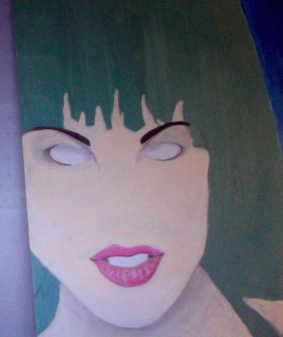
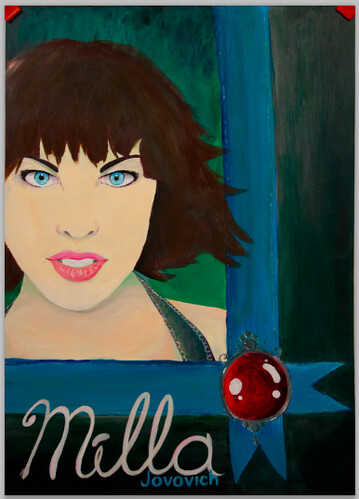
prog1
Blocking in colours, starting to refine detail in the face area!
Lost her nose briefly as I was laying in colour! Oh Noes!

prog2
Found her nose again!
I wanted to keep almost all the sharp detail in her face, in order to draw attention to it.
I spent a lot of time with my nose up to this board.

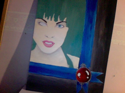
prog3
Time to lean back and work on some larger elements!
The large red gem laying over the ribbons is one of my favourite aspects, I love how it contrasts against the cool greens and blues and really gives your eye something to look at.
Eventually her lips will be a similar shade shade of red to help the design flow.

prog4
Finally got rid of that hollow, terrifying eye.
She looks much better with both, I think.
It was about now that I started playing with her hair overlapping the frame/ribbon to add another element of depth.

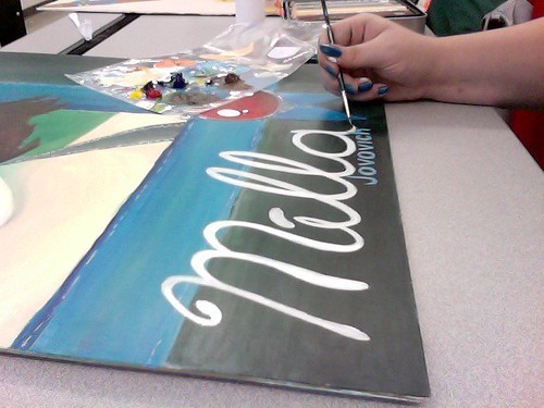
prog5
I'm not really comfortable with rendering text in traditional mediums, but I wanted her name to have the same painterly appearance as the rest of the image.
I planned to add more typography digitally at a later date.

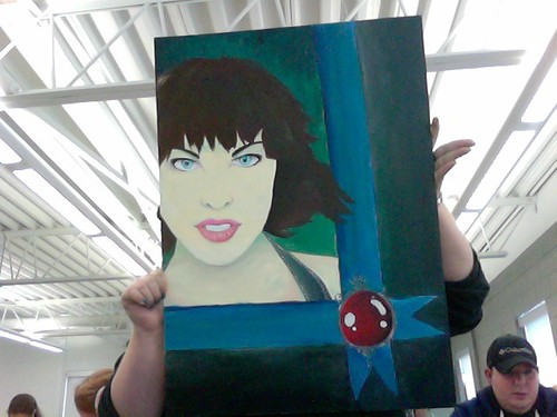
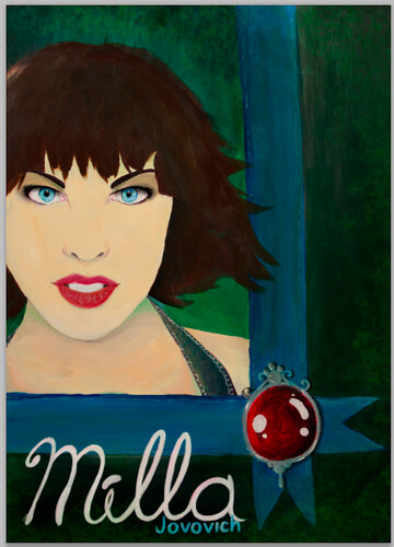
final rough 
Here's the raw, photographed version of the final poster, shot in the studio with the help of Jess Oddi, Jen Ridder and Zoheb Shaikh

final retouch
And the final retouched version, adjusted and edited in Photoshop CS5.
I focused primarily on emphasizing her eyes and lips, as well as bringing the gem out from the background.

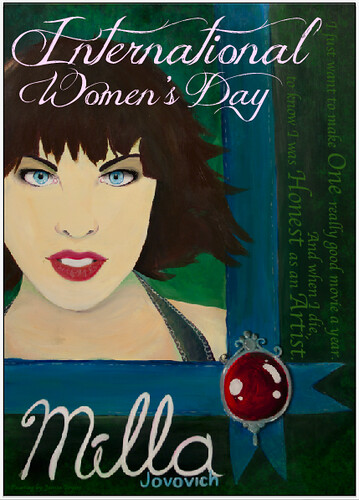
final final
And the final thing!
Added my typographic elements, and a lovely quote from the lady herself.

"I just want to make one really good movie a year. And when I die, to know I was Honest as an artist." -Milla Jovovich

-JessB

Wednesday 8 February 2012

I can see the future...

And the future holds SHIRTS!
SHIRTS EVERYWHERE!

IT'S ALL MY DREAMS COME TRUE!

Thanks to an opportunity presented to me, I'll be able to print up a number of my shirt designs on actual shirts for a reasonable cost!
What this also means, is that if anyone is particularly interested in purchasing shirts from me, I can finally fulfil that wish!

I have to go get the shirts myself, and I won't be printing for a few weeks, so there's plenty of time to figure things out. I don't know specific prices yet, so if you'd like to discuss any sort of purchase, please understand that I'm still nailing down prices, and I don't have any figures to show to anyone yet.

If you're interested though, please let me know so I can start buying blank shirts ASAP, as I'll be printing them myself :)

So if any of my shirt designs that have been posted on this blog interest you enough to want to proudly display them on your body, please get in contact with me! :D

As well I'm wide open to printing any of my older pieces on a shirt!
For a sampling of some of my miscellaneous art, visit my DeviantArt account!
I will be printing the following for sure!

If something you'd be interested in purchasing is not on this list, please let me know!
You can contact me by E-mail any time at jessica.bryers@gmail.com

or if you prefer more traditional means of communication, your pigeon will know where to find me. 

Stay tuned for finalized mock-ups of what I'll be printing and selling!

-JessB


Tuesday 7 February 2012

All she wants is dessert.

"Forward".
This week's word.

I definitely reached way outside of the box for this one, hehe. I started with looking up the definition to 'forward' in the dictionary, and came upon one I really liked, as well as a text sample that inspired my design for his week!

Kids are so picky, and they don't care who knows, haha.

I had seen a number of images by Susan Perl, and fell in love with he way she portrays children in her illustrations. They had so much emotion in their faces, despite the simple style, which I tried to emulate in my own work.

I started with initial sketch (which you can see above), and the first thing I changed were the Monster Parents in the back. I wanted them to look more like creatures and less like demons, I also chose some more entertaining expressions!

I wanted the 'adult' figures to be less prominent than the child, so I coloured them more like shadows than figures, and focused almost all the colour on the figure in the centre.
I actually went through a lot of different hair colours before I settled on this one. Initially I wanted to make her blonde, because it was cuter. But she's a monster as well, so I wanted her to be less cute. I eventually settled on a reddish hair colour to balance with the green in their eyes.


I Wanted to design this graphic specifically for children's t-shirts (though I'd probably war it myself, hehe.
I like it best against the red! :)


photos found on google

It does seem more suited to a girl's shirt (as the figure is female) but I think it could be worn by anyone.

Hope you like it! :D
-JessB

Sunday 5 February 2012

Painting progression; now with 28% more creepy skin mask!

A quick update on my International Women's day poster!
It's coming together gradually, and I think it's at that point where I have enough down to see the shape it's taking...but not enough for it to look good yet, haha.

I wanted to let it have a loose, painterly look to it. I'm not quite at the level of realism in paining that I'd like to be in order to make her look photorealistic, so large blocks of colour work well for me.

 Started with a base wash of green, to compliment the blues and flesh tones I'd be using in the final piece


  Blue ribbon!
In my thumbnail it was red, but I found that the red ribbon on the dark background looked 
too gothic for this piece.


Creepy skin mask!
Laid in the foundation for her face and blocked out where the jewel is going to sit on the ribbons.

This thing watched me sleep last night.

ಠ_ಠ

Wednesday 1 February 2012

Dia de los Updates

Just to prove that I do take criticism and suggestions well, here's a small update to my Sugar Skulls T-shirt!


Text reads: "Dia de los Muertos" Which translates to "Day of the dead"
:D

-JessB