Tuesday, 31 January 2012

Twirling slowly into madness

More shirt designs!
This time, based loosely on the word "Twirl" I made this shirt design, based on the sugar skulls made on the Day of the dead!

I actually had a really hard time coming up for a design for the word 'twirl'. Initially, dance came to mind, as twirling is a large part of cutting a rug and busting a move, but I found a lot of other people I knew who participated in illustration friday were going the same route, so I tried to branch off a bit.

And as if by magic, "Day of the Dead" By Voltaire shuffled into my playlist. Still trying to think of  a design, the song reminded me of an animation I had seen some years ago with the same song, and some really fun graphics!

And I was inspired. I'd been wanting to Illustrate something with skulls, and what better opportunity than to incorporate some colourful sugar skulls!
I'm a bit late for Day of the Dead, but like Christmas, why only celebrate once a year? :D

I took initial inspiration from this design by Merle Bassett, loving the look of a large thing (in this case, cat. in my case, skulls!) surrounded by smaller versions of itself.


See the finished product at the end, but please browse my process shots too!

Thumbnail sketches

Initially, I was going to make the design a lot more sinister, with a toothy grin on the large skull. I decided to (in a marginally less sinister fashion) remove the lower jaw and have the twirling ribbons coming out from the bottom of the skull, rather than floating around it.

Then it was time for liiiine aaaart!
Liiiiiine aaaaart!


Followed by laying in base colours and simple shading for the headbones.
Fun Fact: I originally had the small skulls simply 'adhered'
to the larger one. Then I thought having them growing
out of it would be way cooler.


And then the fun really began! I went on a tour of the internet, picking up different inspiration images for the sugar skull designs. Here's some I chose at random.

I gathered several key concepts from my research:
  • Colourful.
  • Lots of detail.
  • Flowers.
So I took some ideas and references from my research and incorporated them into my design. I also coloured the ribbons with a subtle reference to the Mexican flag :)
thought that was a nice touch, and subtle.


Next, and final step was to add some texture to it! I thought it looked a bit too pristine for a heap of skulls, so I added a gritty paper texture with a hint of yellow to the design.


And here it is, mocked up on a shirt.

I went with a dark grey shirt again, just because the lightness of the design really pops against it.
I tried it against a white tee, but it looked really flat and boring.
The ribbon tails would wrap around to the back of the shirt, just to add that little bit of extra movement to the design!

Thanks for checking this out :D I'd love to hear your feedback and comments!

-JessB

Tuesday, 24 January 2012

pretty ladies/random post time

When I'm bored I draw pretty women.


More people need to require me to draw ladies for them, because I feel like this is a niche I can fill, haha.

By the way "Thil" and "Thilath" are online aliases I've gone by in the past!
Most notably on deviantart!

Monday, 23 January 2012

Progress!

Been playing with some colour ideas for my women's day poster as of late.
I don't want to go for a super realistic look, I want to make it somewhat stylized, with a lot of emphasis on strength and beauty.

I find myself leaning towards the second colour scheme, with the darker borders and the intense, almost spotlight-like focus on her face.
I don't want to paint it all in black of my final, but  really like the halo of light around her portrait and the fairness of her skin.

I want to do the ribbon in blue, though, instead of red. I think it looks a bit too gothic/creepy with that much red and black together.

just some totally huge pencil roughs.
there's also some super faint text at the top that reads:
"International Women's Day"

Just a little update to keep everyone interested! :D
I'd love to hear your opinions and feedback on my stuff, and I love comments!

-JessB

Friday, 20 January 2012

Prepare the Preparations!

This friday's illustration theme, as well as a mega-awesome Ludo album. Just sayin'.

What better reason to prepare then the eventual rise of the undead? I think it's as good a reason as any, personally.
I wanted to create a design to go on the side of a bag (preferably a tote or messenger bag) that would help the owner organize themselves for the eventual zombie apocalypse.
I was circling around some ideas for a more illustrated design featuring a number of monsters 'preparing' for their night out.
Presumably a night spent chasing people through the woods or tempting them into cursed mansions.
You know, a standard monster's evening.
I decided, however, to keep my design more functional and went with a nice checklist of things to keep in your bag.

I pulled the text elements together in adobe illustrator first, taking inspiration from my library of zombie books for the fonts and colours involved.
'Cake pops and zombies' actually sums me up pretty well,
as a person.

I then went to a Mr. Leonard Lionni for some stylistic guidance for my illustrated aspects. I love his simple lines and large shapes.
Oh god they're so cute.

And then I ran with it. a number of ideas changed as I went through the process of designing and arranging my layout and graphics. In the end, I came up with this!
"I like long walks on the beach and a nice brain shared between friends."

Here's the final product, all assembled and lovely!


happy hunting!
-JessB
Monday, 16 January 2012

Women's Day, 2012!

International Women's Day is approaching! March 8th has been set aside as a special day to appreciate all those special women in your lives, as well as the ones you admire from afar :)


For this occasion, I'll be creating a poster to commemorate one of my favourite ladies, Milla Jovovich!

I've loved her in movies, she's such a strong female presence that it's impossible to ignore. Match that with her musical talents, her modelling career and so much more, she's a real inspiration.

Plus she's drop-dead gorgeous, but let it be known that's not the only reason I chose her! ;)

The final product will be painted with acrylics, but before that happens, here are some of my thumbnail sketches to keep you all on the edges of your seats.
Quick, loose and scribbly. Just how I like 'em.
I've decided to go forward with the last design seen here (not the wolf thing...my margin-doodles snuck into this scan...), with a nice large portrait image as the focus :)

And never without inspiration to springboard off of, Id like to introduce you to a gentleman by the name of Al Parker, one of the giants of Graphic Design.

I love this picture. To bits.
To. Bits.
The simplicity of it is so great, the way he separates foreground, middle ground and background with basically nothing more than some simple lines and some overlapping and cropping is just wonderful.
I plan to take his method of line art against blocks of colour and use it to my advantage. I'd also love to find a way to incorporate this sort of background into my own image.

So, exciting times ahead!

JessB

Saturday, 14 January 2012

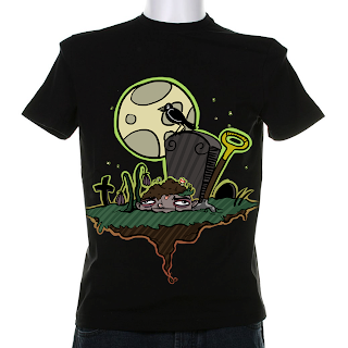
Grounded. Also a shirt.

My first illustration is complete!
I'll show you the finished product at the end of this entry, But first allow me to walk you through my process for this piece!

As I mentioned in my previous entry, I wanted to take some of Art Shipman's style and involve it in my own work. I started out knowing I wanted to make a T-Shirt graphic, and know his (as well as my own) Cartoony style would work wonderfully.

The word I was given to base this graphic around was "Grounded", and while it has many different meanings, I chose to run with a dark monster-related theme depicting someone literally stuck in the ground.

I decided on my favourite thumbnail and refined the line art over top of the thumbnail sketch first. Given the loose, freehand sort of feel I wanted it to have, I left most of the line art as it was on the first pass. I didn't want it to look too crisp.

After that, I went at it with colours! I wanted to make sure I used some bright eye-catching colour, despite the somewhat dark subject.
I ended up sticking with a familiar colouring methods, taking little bits and pieces of Mr. Shipman's scribbly, hasty colouring style.

I find it really hard to colour outside the lines sometimes.

Here's the final design mocked up on a model shirt!
Overall I had a great time with this illustration, and I'm looking forward to next week's project! Here's a closeup of the face details :)


-JessB

Tuesday, 10 January 2012

Illustration tuesday? Yes!

Illustration Friday is such an exciting site. It's an awesome tool I've been introduced to in order to keep my creativity on the move!

http://www.illustrationfriday.com/

This week I've encountered an artist by the name of Art Shipman, and I've fallen in love with his loose cartoony style and blocks of bold colour.
So much fun.

So for this week's Illustration Friday word (Which is Grounded) I'm going to try and incorporate some of his fun style into my T-Shirt graphic.


I've got some ideas bubbling in my brains, tune in soon for the finished product!

-JessB

Design ALL the Things.

I'm blogging and this is very exciting!

I'd just like to leave this introductory post to introduce myself!
I'm Jessica Bryers and I'm a Graphic Designer!

The whole blogging experience is very exciting and I'd like to kick it off with a journey into Illustration Friday.
http://www.illustrationfriday.com/

I'll be showing my creative process from inspiration to concept through to finished pieces during the next couple months!

Hopefully everyone has as much fun with this as I do!

-JessB.